Emarsys Logo
Modern, diversity, positiveness.
The Emarsys logo is the most recognizable brand asset of the company. It incorporates everything the company stands for: modern, diversity, positiveness, technology and creativity.
Construction
The origin of the Emarsys logo is set in a 3-dimensional square, set in the green color scheme. With the simplification to layers similar to an iconic ”server architecture”, and final minimization to the so called ”Emarsys Slashes”, it represents the abstract visualization of the letter ”E”. Final refinement of emphasizing the slashes by adding the main Emarsys brand colors, and shorten the bottom slash for balance reasons, results in the final Emarsys figurative mark, called the “Emarsys Bug”.
Straight Version
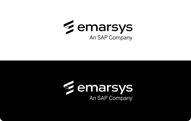
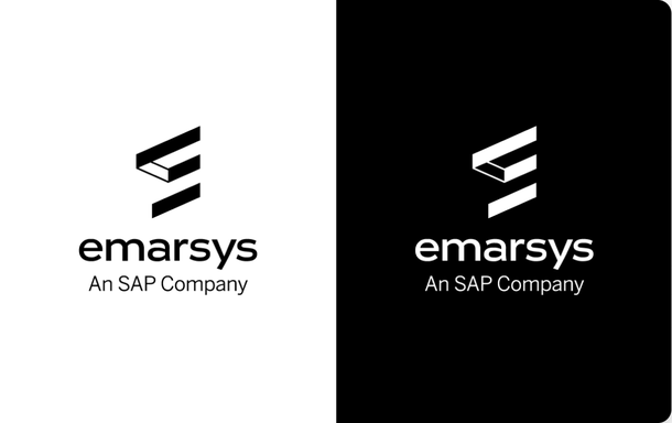
The straight logo is the standard version of the Emarsys logo and should be used for any general purposes. The preferred logo is the colored logo with the blue “Emarsys” text on white background. The version with “Emarsys” in white text should only be used on the dark blue background of the Emarsys color palette.
The most recent variant of the logo reflects that Emarsys is now “An SAP Company“ with a tagline right-side aligned.
Ensure color accuracy by using the most recent color-corrected logo files in CMYK, RGB and Pantone.
Stacked Version + Bug
The stacked version of the Emarsys logo should only be used for vertical layouts or, depending on the area available, if the space where the logo is to be used is square, The single bug logo should only be used for assets that include either the horizontal or the stacked version of the logo somewhere. There may be exceptions to this rule, but please always work with the Emarsys Creative Team to decide.
Monochrome
The black version of the Emarsys logo should be used only due to color restrictions (e.g. merchant receipts, faxes etc.) or where the full color logo is not an option. Both versions are optimized for one color usage, which effects the overall appearance of the logo: the only “negative“ slash is represented visually with two lines connecting the upper and middle slash of the logo. There is no b/w version of the logo that features a solid bug.
The Protection Zone / Spacing
Always maintain the required clear space around the logo.
Clear space – Print: In print materials, the preferred amount of space around the logo is equal to the width (X) of the smallest slash in the logo. This effects the horizontal of the stacked version accordingly.
Clear space – Web: Maintaining 10 pixels of clear space is always preferred.
Minimum Logo Sizes
To ensure legibility, the logo features different minimum sizes for different usages:
For print use, the horizontal logo should never be reduced below the minimum size of 20mm x 6mm. The stacked logo therefore should never be smaller than 13mm x 12mm.
In digital executions, such as web ads, don’t make the horizontal logo smaller than 70 px wide OR smaller than 21 px in height. The stacked logo should always have the minimum size of 40px in width or at least be 38px high.
Guidelines
If you don’t know what you are allowed to do, please get in contact with the Creative Team.
Do’s
This table features the most important usage guides and rules for all Emarsys logo variants.
| Background | Colored Logo | White Logo | Black Logo |
|---|---|---|---|
| White | |||
| Black / Grey | |||
| Colored | |||
| Imagery | |||
| Pattern |
* Exceptions are possible if the background allows it. In case of doubt please contact the Creative Team.
** Background needs to provide enough contrast, otherwise no usage allowed.
| White Background | |
|---|---|
| Colored Logo | |
| White Logo | |
| Black Logo | |
| Black / Grey Background | |
|---|---|
| Colored Logo | |
| White Logo | |
| Black Logo | |
| Colored Background | |
|---|---|
| Colored Logo | |
| White Logo | |
| Black Logo | |
| Imagery Background | |
|---|---|
| Colored Logo | |
| White Logo | |
| Black Logo | |
| Pattern Background | |
|---|---|
| Colored Logo | |
| White Logo | |
| Black Logo | |
* Exceptions are possible if the background allows it. In case of doubt please contact the Creative Team.
** Background needs to provide enough contrast, otherwise no usage allowed.
Don’ts
The Emarsys logo should not be altered. These logo standards apply for all content that is owned and controlled by Emarsys, including cobranding and partnerships.
Do not change the relationship of the symbol to the logotype.
Don’t place the logo on backgrounds that provide insufficient contrast.
Don’t add effects like shadows, dimensions, and gradients to the logo.
Don’t stretch the logo.
Don’t compress the logo
Don’t place the logo over busy photographic backgrounds.
Do not use the logo as part of a sentence within a block of copy.
Don’t alter the color specifications within the symbol or the logotype.
Do not attach text of any kind to the symbol.
Don’t place the logo on top of an object.
Do not use an old logo. Please make sure you`re always using the latest files.
Don’t tilt the logo.
Do not use the black logo on any colored background.
Don’t create nor use a stroke version of the logo.
Do not use a version of the logo where the bug is one solid color.
Don’t change position of logo lockups
Sub-brands
With the addition of the tagline to the main Emarsys logo, the principle of every Emarsys sub-brand has changed. In order to ensure a clean visual representation the sub-brand replaces the general tagline “An SAP Company“. This way the sub-brand doesn’t get in conflict with the tagline.
This principle preserves the direct link to the company itself, and also sets consistency and equality to all areas. Main goal is to prevent a dilution of the Emarsys brand by presenting it within a range of different sub-logos. If you’re in need of an Emarsys sub-brand logo, please get in contact with the Emarsys Creative Team.
Partner Logos
To display the partnership between Emarsys and an Emarsys partner or a different collaboration, the horizontal logo and the partners’s logo are divided by a thin line. This ensures the clear space area for each logo but also emphasizes each company’s own business. Please get in touch with the Creative team if you need an Emarsys Partner logo, as this requires adjustments for each specific request.
Download the Emarsys Logo Sets
The set for web logos includes the horizontal and stacked logo in JPG, PNG, AI and SVG format, while the print set features formats of EPS, AI and JPG.